If looks could sell
July 2, 2009
How leading Publishers create impact on target audiences through covers – Amazon Top 5 Tour (accessed 1.7.09)
Today, Seth Godin commented on the purpose of book covers.
“Is the purpose of the cover to sell books, to accurately describe what’s in the book, or to tee up the reader so the book has maximum impact?
The third.”
Let’s take a look at Amazon’s top 5 titles to see what is making an impact, how, and on whom. These successful approaches provide guidance on how to package your ideas successfully in a very congested marketplace.
1. Glenn Beck’s Common Sense: The Case Against an Out-of-Control Government, Inspired by Thomas Paine
Designer: Ruth Lee Mui
Publisher: Simon and Schuster
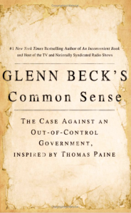
To handle the amount of text the background image is plain. Soft, aging paper evokes a sense of history.This ties into the reference to Thomas Paine, and is reinforced by the 19th century style typeface. The centre-justified text tends to stack up like a “Wanted” poster of that time. This sets the tone that someone (the Government) is about to get a shellacking! All these features tie together successfully to impact on older men seeking a return to common sense.
Main appeals: History, lost wisdoms.
Target audience: Baby Boomer skewed strongly to male.
2.Sookie Stackhouse, Books 1-7 [BOX SET]
Designer: Uncredited
Publisher: Penguin

This is a striking physical package. The box set leads with a relatively sexy vampire licking her bloodied lips. Her pale skin contrasts with the shadows and lipstick and the trickle of claret. This creates a certain voyeuristic intrigue. The spines facing out of the box approximate a rack of glam-rock coffins that say “fiendish and fun” – aiming to impact on female readers seeking some escape from the mundane.
Main appeals: Horror, sex, gothic mystery with shades of romance.
Target audience: Gen X to Boomer skewed to female.
3. Catastrophe (How Obama, Congress and the special interests are transforming…a slump into socialism ad a disaster into a Catastrophe…and how to fight back)
Publisher: Harper COllins
Designer: Unknown

This cover uses typography and colour only. The effect is like a busy political poster.
The sans serif type adds a contemporary appeal, although the drum-beating message seems as old as Adam. The author’s names and the title are brought forward through the use of white against the orange background. The subtitle, which strategically reads like a cloud tag of high volume words, is stacked like film credits. Overall the effect is of accumulated, building urgency and impact on mature, conservative men worried about America.
Main appeals: Call to arms on big issues.
Target audience: Boomer and beyond, skewed to male.
4. The Shack
Designers: Marisa Ghigleri, Dave Aldrich, Bobby Downes
Publisher: Windblown Media
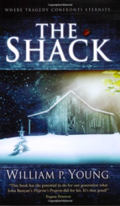
This cover is a graphic tiramasu. We move through three vertical layers, top and bottom ones mirrored. The effect is literally peering into a gap of a fence. This creates a rich sense of symbolism about borders, eschatology and the construction of the universe. To offset this, the actual details are earthy and real: timber grain. snow. A little ladybird, perches innocently – or so it seems. The big serif type promises a big, serious story. This creates impact on mature female readers looking for just that.
Main appeals: Call to arms on big issues.
Target audience: Gen X to Boomer, slightly skewed to female.
5. The Guernsey Literary and Potato Peel Pie Society
Mary Ann
Designer: Roberto de Vicq de Cumptich
Publisher: Random House
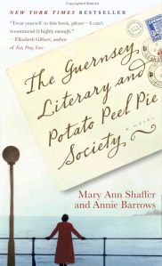
The high word count on this cover is managed by overlaying an image of an angled envelope. The typeface on the envelope effects handwritten text which further humanises the tone of the eccentric title. The soft yellow pastel of the envelop ends in drop shadow, and the image of the lonely, mature woman gazing out to sea. The colours blend easily, warmly. There is no challenge here. This has all the markings of a warm and fuzzy “feel good” story, impacting on a mature female audience.
Main appeals: Lovable human eccentricities. Women’s wisdom.
Audience: Baby Boomer, skewed strongly to female.
July 4, 2009 at 11:49 am
Ben, you’ve written a great blog post here. The “copy”, as well as the “look and feel” of each cover gets the attention of its target audience. I loved the Glenn Beck one, which looked like an old document (implying the Constitution).
I think I’ll be retweeting about this blog post.
@paulhancox
July 4, 2009 at 1:41 pm
Thanks Paul! Appreciate your taking the time to comment.
September 3, 2009 at 4:31 pm
Great post Ben! I just found your link from a twitter RT.
I particularly like your descriptions of why each one appeals to the intended audience. Leaves me with lots to think about.
Max
@smaxbrown
September 3, 2009 at 11:16 pm
Thanks for the thoughtful comment Max.
February 21, 2010 at 2:31 am
Hi Ben,
In doing a google search I came upon this older post of yours. I was one of the designers of The Shack. 10 million copies in print and it’s still on the NY Times best seller list for almost 90 weeks. We had no idea that that book would become so successful. (If only I had half a penny for each one…!)
Dave
February 21, 2010 at 4:44 am
Hi Dave
I’m so glad you found me this way. Its always a thrill to hear from a key player in a success story. There’s no way of predicting some successes I guess, but I’d say that if alrichdesign is involved the odds just narrowed.
best for the future
Ben
July 2, 2013 at 1:59 pm
[…] Fascinating analysis of the cover art for the top 5 Amazon books:https://publishsmarts.wordpress.com/2009/07/02/if-looks-could-sell/ […]